
A practical guide to writing prompts that actually produce professional-grade visuals
Getting an AI image to look good is easy. Getting it to look right is another story.
You need to put a few phrases in a image generator and you get something intriguing in seconds. Usually the trouble comes later – the lighting is wrong, the composition is wrong, the backdrop is too cluttered or the outcome is just not what you had in mind.
That’s when how you compose your prompt becomes important. More information about the subject, style, lighting, colors and mood might help the image generator make better decisions. From then, little changes may transform an intriguing initial try into something usable.
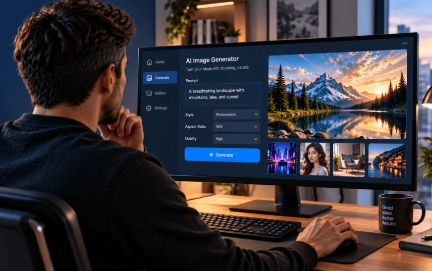
The GPT Image 2.5 AI image generator can support different ways of developing an idea, including prompts, sketches, reference images and targeted edit instructions. Rather than expecting the first result to be perfect, you can treat the process more like a back-and-forth creative session.
So, what actually makes an AI-generated image better? Here are five techniques worth trying.
Key Takeaways
- Build prompts around the subject, medium, lighting, color palette, and mood.
- Experiment with different artistic styles and visual mediums.
- Refine promising results through targeted edits instead of starting over.
- Use clear instructions to avoid unwanted visual elements.
- Maintain consistent visual characteristics when creating multiple images.
1. Write Precise, Structured Prompts
A short prompt can work, but it leaves a lot of creative decisions to the image generator.
Take something as simple as:
Cyberpunk city
That’s enough to produce an image, but it doesn’t tell the generator what kind of city you want, how it should look or what atmosphere you’re aiming for.
A more detailed version could be:
A very detailed digital painting of a futuristic tokyo alley at nite. Wet pavement with rain. Dramatic volumetric lighting. Vibrant purple and cyan colors. Atmospheric mood. Realistic materials.
Now there is a lot more to work with. The topic is evident, yet the medium, lighting, color palette and atmosphere steer the image in a certain way.
When composing a prompt, consider the information you would ordinarily provide to a designer or imagegrapher:
- What is the subject?
- How should it look like?
- Where does the light come from?
- Which colors should dominate the scene?
- Should the end outcome be dramatic, playful, realistic, vintage or minimalist?
You don’t have to make each prompt into a paragraph. The goal is to include only the most important facts.
The GPT image 2.5 AI image generator is very beneficial for developing ideas that go beyond a mere word explanation. Starting with a question, drawing or reference image expands your ability to explain what you’re attempting to accomplish.
2. Experiment With Different Styles and Mediums
Sometimes the problem isn’t the subject. It’s the visual direction.
The same idea can look completely different when you change the artistic style or medium. A mountain cabin, for example, could become a cinematic photograph, a watercolor painting, a 3D render or a vintage travel poster.
Try giving the same subject different treatments.
For example:
A mountain cabin surrounded by snow, cinematic landscape photography, soft morning light, muted blue and white palette, realistic textures.
Then try:
A mountain cabin surrounded by snow, detailed watercolor painting, loose brushwork, soft pastel colors, peaceful winter atmosphere.
The subject hasn’t changed, but the result can feel completely different.
An AI art generator might be helpful when you’re playing around with numerous styles, especially if you want to see how the same idea does in a variety of genres. Don’t just settle on the first image that looks good develop a few variations and compare.
This is very useful for marketing efforts and content production. A genuine product shot may be ideal for an online store, whilst an illustrated or styled version may be better suited to a social media campaign.
The optimal communication style is determined by the message you want to convey.
3. Refine Through Iteration, Not Single Attempts
A good initial image does not necessarily require replacement. Sometimes all that is required is a few minor tweaks.
Take a close look at the results. Perhaps the subject is correct, but the lighting is too severe. Perhaps the composition is effective, however there are distracting items in the background. You could even enjoy everything but the color treatment.
Instead of starting again, tell the image generator what needs to change.
For example:
Keep the same subject and composition, but use softer cinematic lighting, reduce background clutter, and maintain the existing color palette.
That’s much more focused than rewriting the entire prompt.
Reference images may also be useful when you wish to keep the same subject, product, composition or visual direction while making modifications elsewhere. Targeted editing is important for the same reason, it allows you to focus on the parts of the image that aren’t functioning without abandoning anything else.
Let’s use the first generation as a baseline. You don’t need to toss away much of the image to change one or two things.
4. Give Clear Instructions for Unwanted Elements
AI-generated images might not always match your intentions exactly. An otherwise strong image may have an unneeded object, a distracting background feature or text that should be replaced.
When that happens, be specific about the problem.
Suppose you’re creating a product image and the background is cluttered. Instead of simply asking for a “better background,” try:
Keep the product unchanged. Remove the distracting objects in the background and replace them with a clean, minimal studio setting.
The instruction tells the generator both what to keep and what to change.
The same idea works for text. If you’re creating a promotional poster, for example:
Add the headline “Summer Collection” at the top of the poster using clean, readable typography with sufficient spacing around the text.
Specific instructions make it easy to predict the following outcome. They are especially handy for designing graphics for commercials, social media postings, posters, packaging, presentations and other business ventures.
Rather than making a long list of what you don’t want, begin with the most obvious issue. Once it is resolved, you may assess whether anything else requires attention.
5. Keep a Consistent Visual Identity Across Multiple Images
A good image is useful. A group of photographs that appear to belong together is significantly more beneficial for a campaign.
Imagine three images for one brand. The first is brilliant neon hues, the second is subdued earth tones and the third appears like an entirely new creative medium. Each may function on their own, but collectively they might feel disjointed.
A simple way to avoid that is to establish a few style anchors and reuse them.
These could include:
- A consistent color palette
- Similar lighting
- The same artistic medium
- A recurring texture
- Similar composition
- A defined mood
- Consistent character or product details
For example:
Warm golden-hour lighting, muted earth-tone colors, cinematic composition, realistic textures.
You can keep those characteristics in your prompts while changing the subject.
Reference images are also useful when attempting to keep an identifiable product, character, composition or overall visual direction throughout numerous generations.
This method is extremely beneficial for marketing campaigns, social media content, product debuts and other projects that require several photographs to seem like they belong to the same collection.
Turn Better Prompts Into Better Images
AI picture generation can speed up the creative process, however the first output is not necessarily the ultimate result.
A better image is typically the result of a few easy tweaks, such as adding a missing feature to your prompt, experimenting with a different visual style, altering one aspect of an image you already like or maintaining the same visual direction over a series of photographs.
Whether you’re designing a social media graphic, product visual, marketing asset, concept illustration or branded campaign, begin by telling the image generator just what you need. Then look at the output carefully and adjust the details that aren’t quite right.
The more you work this way, the easier it becomes to turn a rough prompt into a polished visual that feels intentional, consistent and genuinely yours.